What's Up Doc?
A Healthcare Mobile App
Introduction
The Challenge: A 4-day sprint to identify a health related issue through user interviews, and design a mobile app to help them solve it.
The Need: Users need a way to locate a doctor who is kind, and knowledgeable about their areas of need.
The User: Through interviews I was able to group people into two major groups:
People who are healthy and are happy to visit any doctor who is kind and available.
People who have a particular health issue and want to visit a doctor that specializes in their area of need.
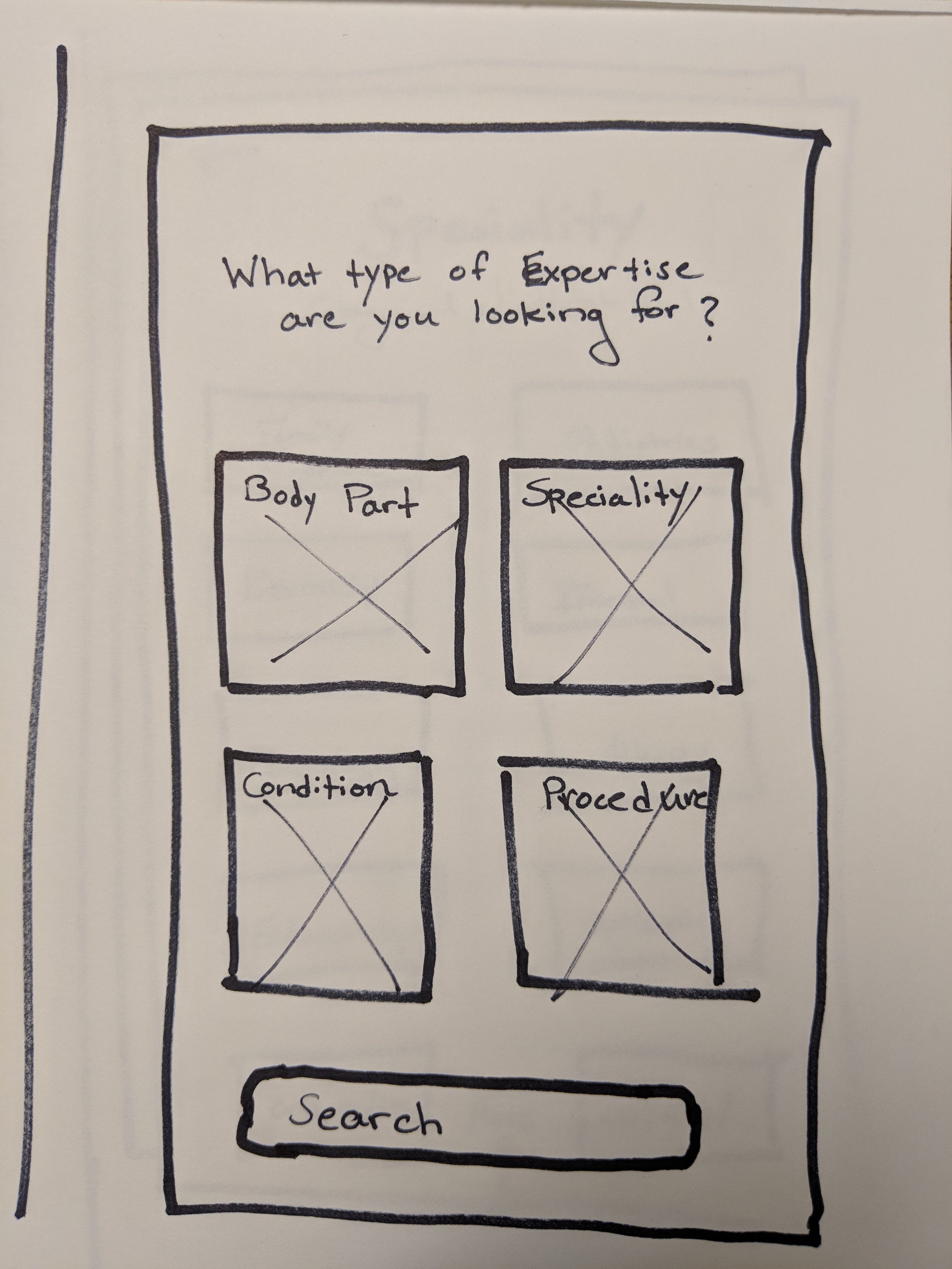
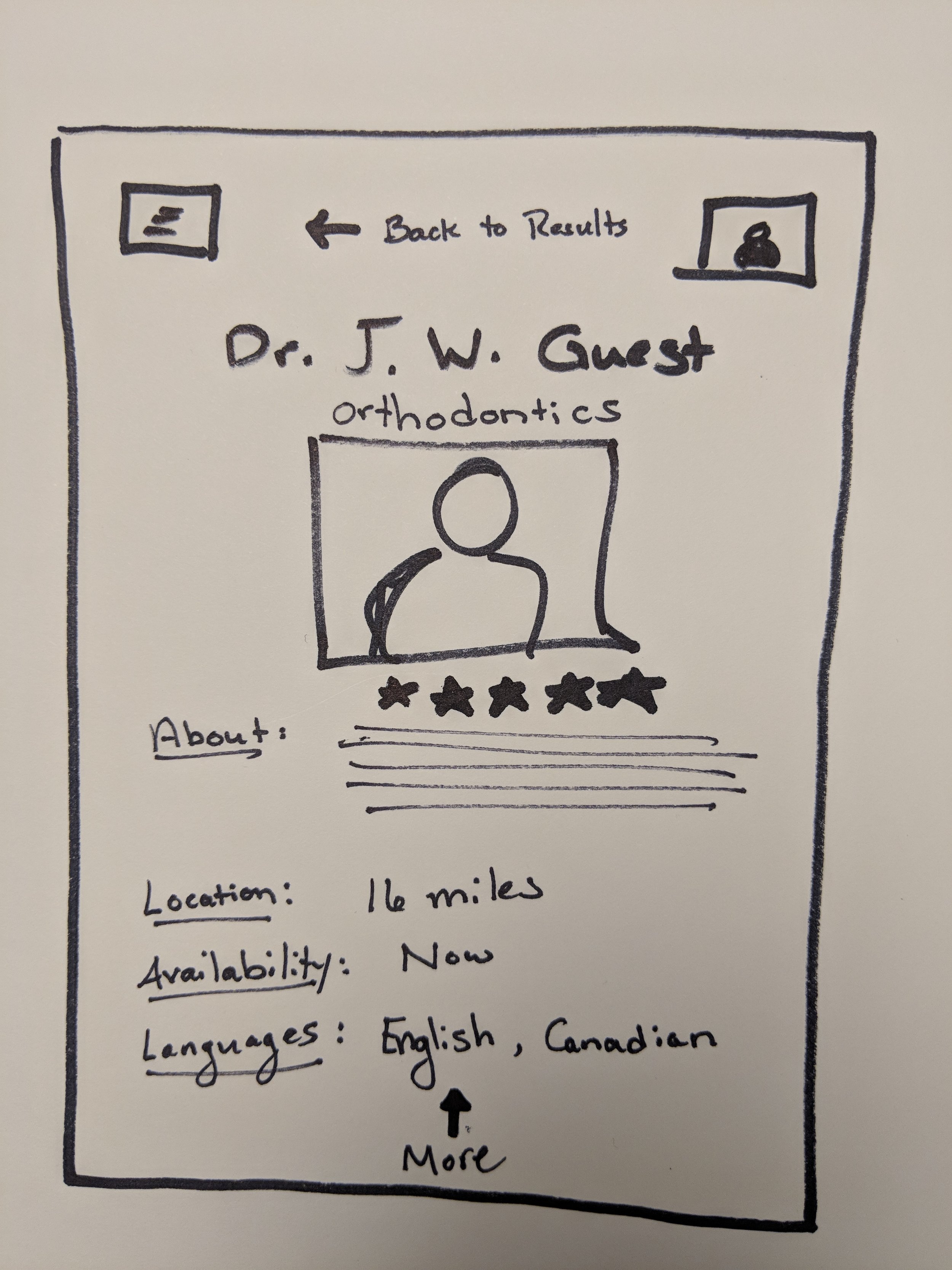
The Result: Users can search for a doctor based on Troublesome Body Part, Doctor Speciality, Medical Condition, or Desired Procedure. They can learn more about the doctor, filter based on basic information, and then request an appointment with the doctor.
Skills
User Research | User Interviews | User Flows | User Testing | Sketching | Rapid Prototyping | Interaction Design | Mobile Design
Tools
Notebook | Balsamiq
User Research & Interviews
Method
I started by interviewing three classmates about their past experiences of locating a doctor. It turned out that all three of them were generally young and healthy. I decided I wanted to interview people who were not so healthy in order to gain a broader understanding, so I also interviewed a couple family members who had more serious chronic health issues.
Insights
What insurance a user had was the most important factor in choosing who they could go and see, so most people looked for a doctor on their insurance company website.
Healthy users might just be looking for a Primary Care Physician or General Practitioner, whereas unhealthy users also need to look for specialists.
Younger users read online reviews, but seemed to take them with a grain of salt. Older users just used the information that the insurance company website provided.
Younger women preferred a female doctor for women's health issues, but other than that all users ranked the most important factors as a doctor that was kind, relatable and listened to them.
Competitors already in the space
https://www.healthgrades.com/
https://www.zocdoc.com/
Sketching & User Testing
Sketches
Updates from User Testing
I start on the home screen with an input for their insurance company and location since those were the biggest choice filters.
At this point I also avoided trying to get them to sign up for an account, since I felt that would turn people away rather quickly. Account signup is located in their Profile.
The second screen allows healthy people to quickly find a general practitioner from the button at the bottom, and it gives users looking for a specialist numerous ways of searching for their need.
User Flow - Walkthrough
A quick (1 minute) walkthrough of the app.
Final Comments
I am very interested in the both UX Design and Service Design in the healthcare industry. There is so much new health technology coming down the pipe, from health record management for doctors, hospitals, and patients; our aging population; a looming biotechnology revolution that will explore genomics, proteomics, and biomedical devices; and IoT and Mobile Technologies that will transform how we measure, and understand our health. From Ayurveda to Nootropics, and everything in between, there is a lot to explore and a lot of ways to help people that are going to be at a particular disadvantage when using technology.


