Claribel — USDA GenAI Chatbot
USDA Farm Loan Programs — Conversational AI Interface Design
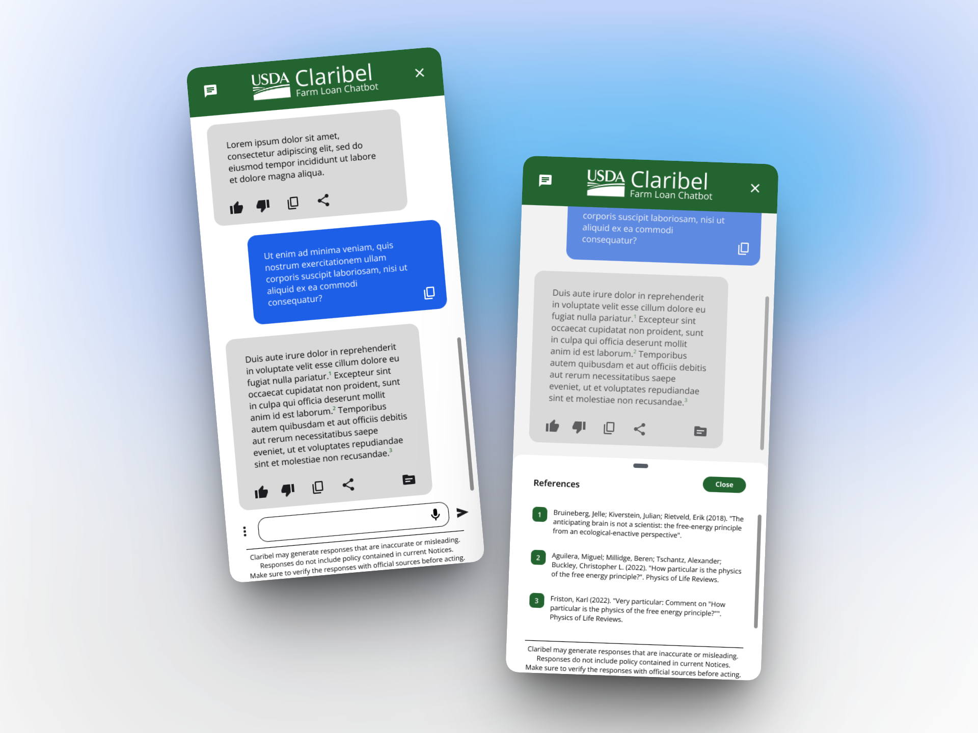
The Situation
A USDA development team had a directive from leadership: build an AI chatbot that could help Farm Loan Programs staff navigate 2,000–3,000 pages of policy handbooks. Developers were standing by, but there was no designer on the team, no product definition, and no clarity on what the chatbot should actually do. Someone mentioned my name because I wasn't tied to a specific product, and the ask was straightforward: we need to know what to build.
The Diagnosis
The first thing I needed to understand was who would use this and what they actually needed. Over 2–3 sessions with the product owner, three distinct user archetypes emerged:
- Customer service reps — need a quick answer while on the phone with a farmer
- Seasoned loan officials — doing deep cross-referencing across multiple policy areas
- Senior leadership — using this on government-issued phones while traveling
Each had fundamentally different needs — speed versus depth versus mobile usability — and a single chatbot interface would have to serve all three.
Beyond the users, three product priorities became clear:
- Ground-truth source access — non-negotiable, since staff need to cite handbook language in official correspondence like adverse decision letters
- Prompt accuracy — the AI model was getting confused between loan making and loan servicing questions and users needed a way to scope their queries
- Structured feedback — so the team could improve the AI's responses over time
I also assessed the AI product landscape — Claude, ChatGPT, Gemini, Adobe's AI assistant — to understand emerging interaction patterns for citation, conversation threading, and document reference. The Adobe AI assistant's split-screen document viewer became a key reference for the citation experience.
The Intervention
I designed the complete conversational UI from scratch in Figma, mobile-first to serve the 20% of users — senior leadership — who would be the most demanding power users on the smallest screens.
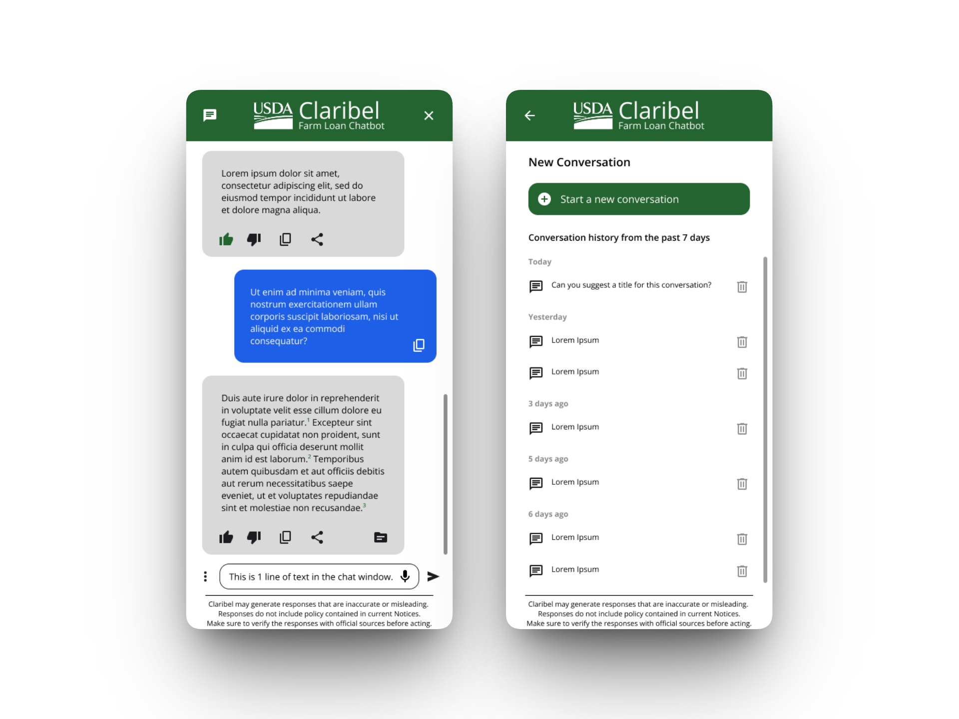
Personality modes solved the prompt accuracy problem through design rather than prompt engineering. The default mode delivers short, actionable answers — suited for a customer service rep who needs a quick reference while on the phone. A "Technical Research Assistant" mode provides longer, more detailed responses with additional references — useful for subject matter experts conducting in-depth policy research. Users could also filter which policy documents the AI draws from, which was critical because the model was confusing loan making and loan servicing when the full corpus was included.
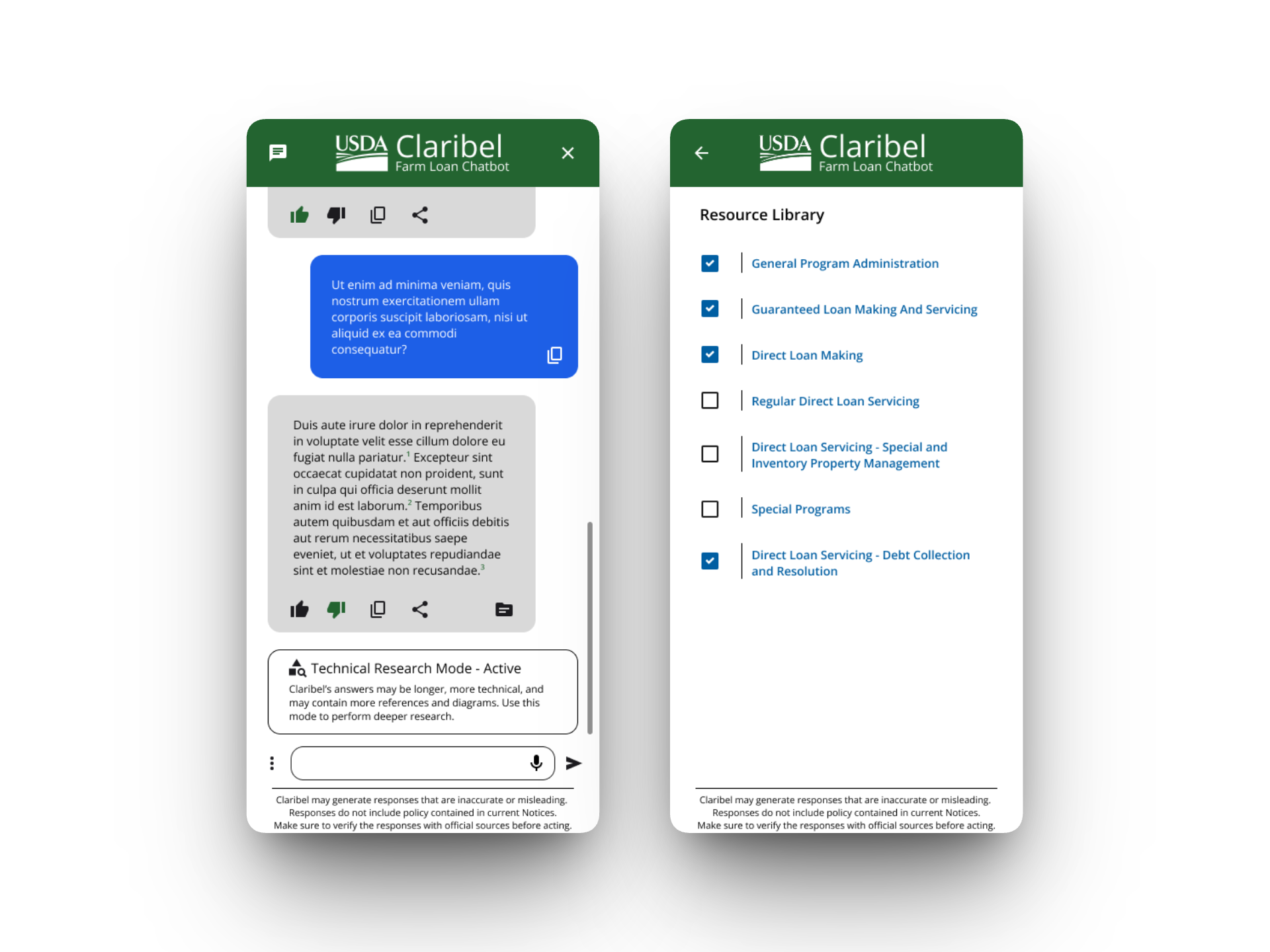
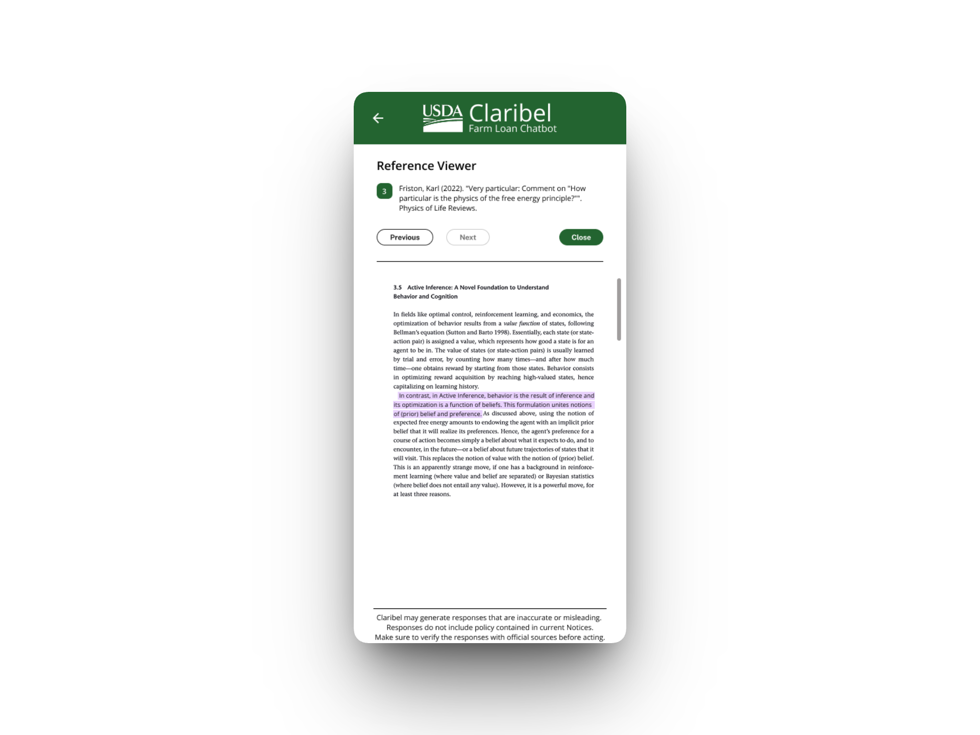
The citation system was the product owner's highest priority. In a government context, the AI's answer isn't the product — the verifiable source is. I designed numbered inline citations that link to a split-screen document viewer showing the highlighted source passage alongside the AI's response. Staff could verify answers against actual handbook language before using them in official correspondence.
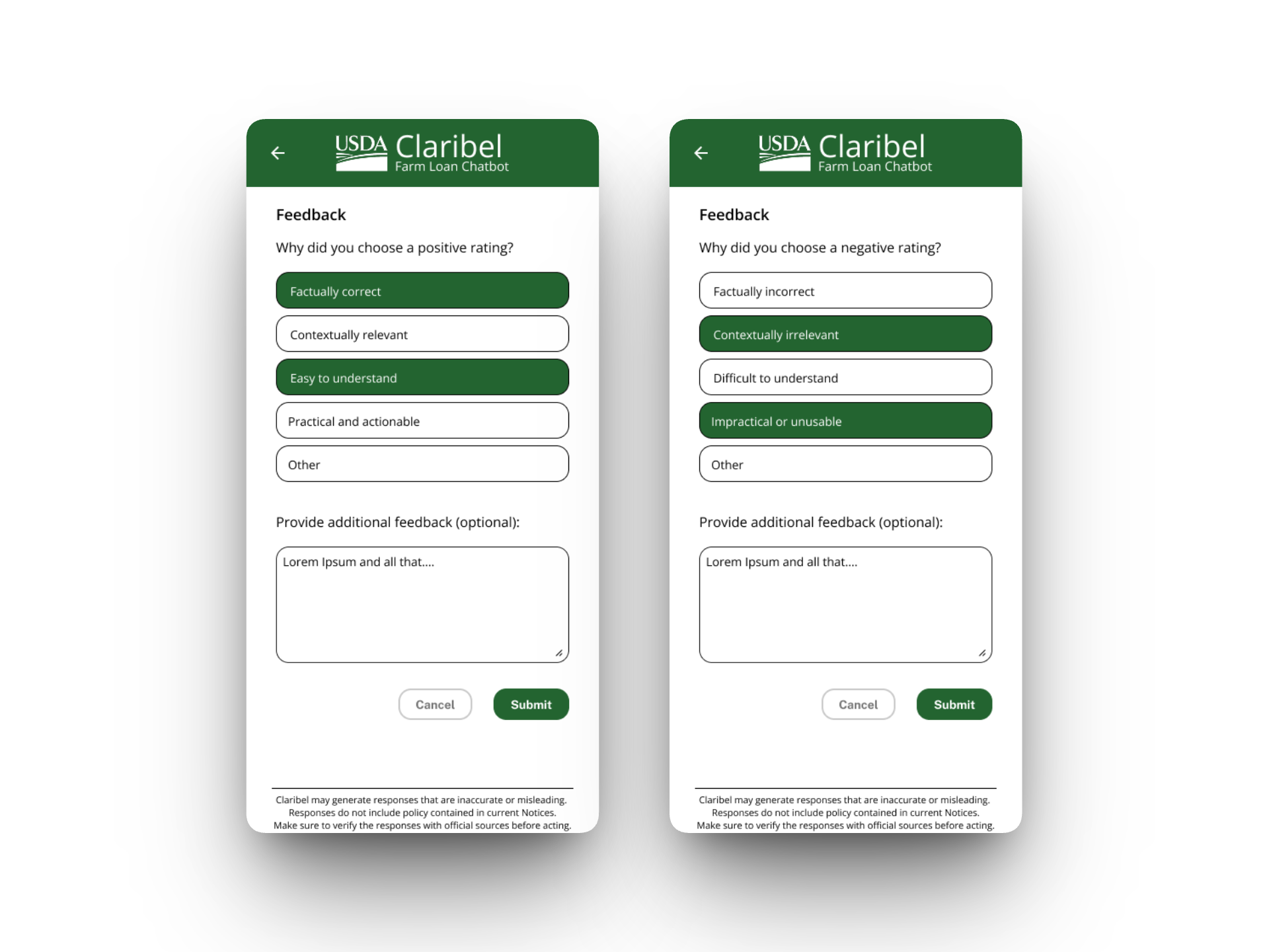
Structured feedback gave the development team actionable data to improve the model over time. Thumbs up/down triggers a screen with specific quality dimensions — factual accuracy, contextual relevance, comprehensibility, actionability — plus an optional free-text field. This turns every user interaction into a training signal without requiring extra effort.
The full design package also included:
- Chat history — with conversation threading
- Voice input and text-to-speech output — for accessibility, particularly for users who would otherwise need screen readers
- Keyboard shortcuts — for power users who live on the keyboard
- Desktop split-screen view — pairing the chatbot with the source document site
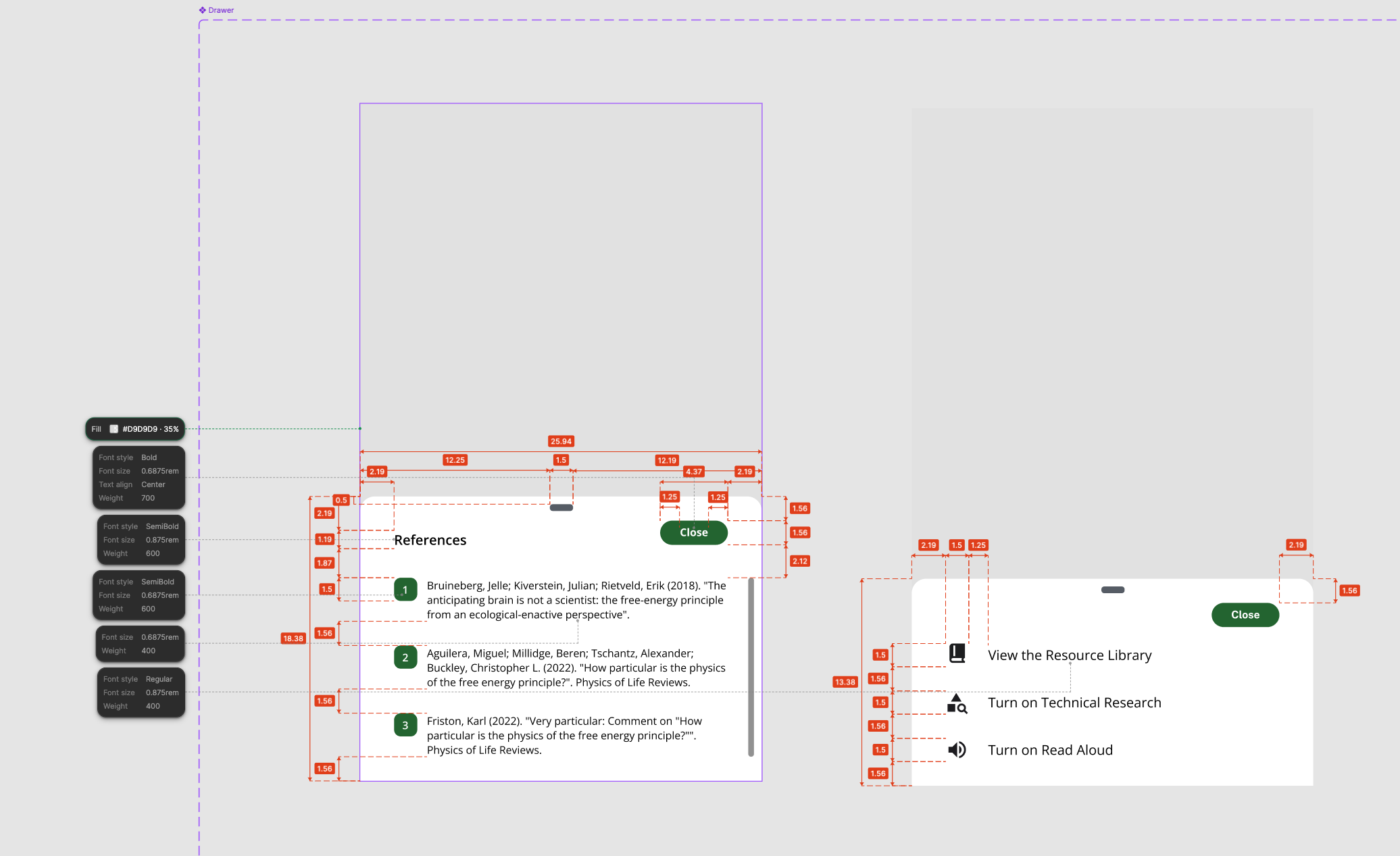
Since the development team didn't have Figma access, I delivered fully dimensioned specs — redlined screenshots with spacing, font sizes, weights, and corner radii annotated — so engineers could implement without ambiguity.
What I Learned
The personality and filtering systems were my solution to a prompt engineering problem that was showing up as a UX problem — the AI was giving confused answers not because the model was bad, but because users had no way to scope their questions. That reframe — from "fix the AI" to "give users control over the AI's context" — is the kind of diagnostic move that defines this work for me. The technical constraint was real, but the intervention was design.
This project also reinforced that designing for AI-generated content requires different trust patterns than traditional interfaces. Everything in the UI had to reinforce that Claribel is a tool for finding information faster, not a replacement for policy expertise. In government, trust isn't assumed — it's built citation by citation.